


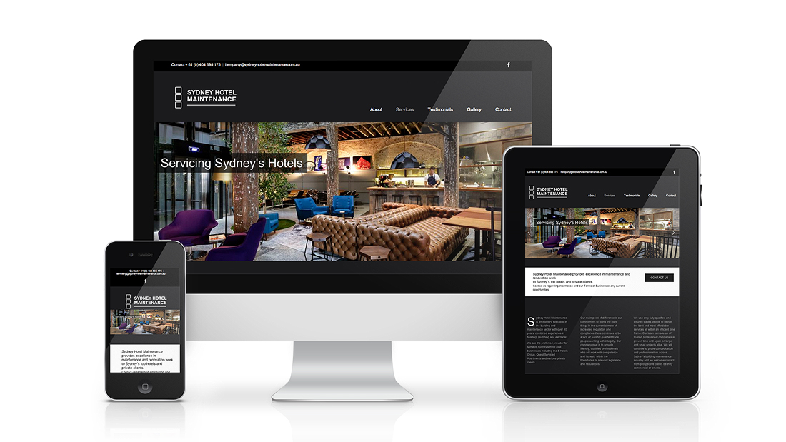
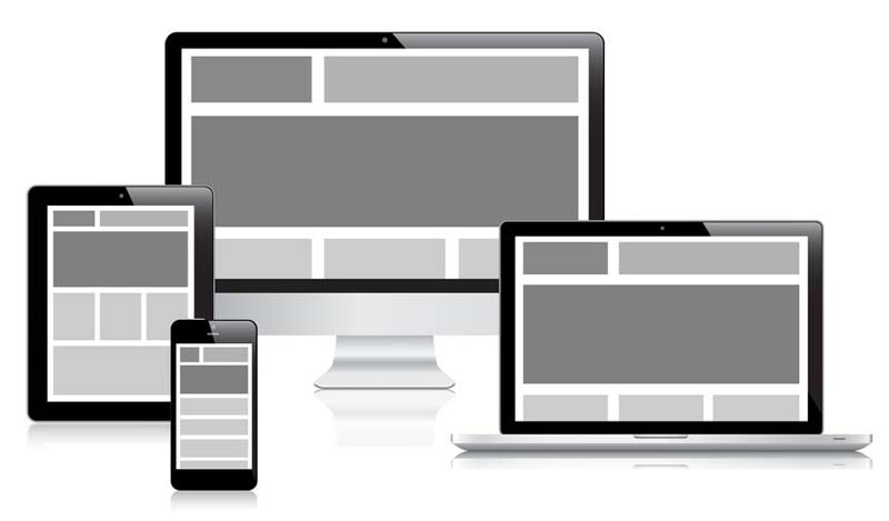
10 Apr Benefits of Responsive Design
Google displays sites it believes are authoritative and relevant. They measure relevance by analysing page content, the words you and I read, and they measure authority (mostly) based on the number and quality of other pages linking to the pages they show, links are like votes.
In 2013, only 6% of the Fortune 100 had sites that complied with Google’s Mobile requirements and had a site that was either mobile ready or in responsive design. Compare that to today and you’ll find that over 87% of the largest businesses have moved into mobile-ready responsive design. Further evidence shows that the number of connected mobile devices exceeded connected PCs as of January of 2014 and that continued growth would have mobile connected devices exceed the world’s 2014 population by 2019.
Whether your company has taken the plunge or whether you’re still sitting on the sidelines, it’s good to know the business benefits of making the move to responsive design.
Increased Conversion Rates
If you build it, they will come. Building a better mobile experience – time and time again- is showing that consumers will convert. One study from Aberdeen Group showed increases in brand awareness, increased revenue, better visitor to buyer conversion rates, more engagement and higher order value.
Further, Nielsen recently reported that 29% of consumers have done some form of online shopping on their smartphone. It’s a number that’s sure to grow exponentially in the coming year.
If you’re selling or marketing anything online a better mobile and tablet experience will surely increase your conversion rates.
Less Cost
In a study conducted recently by Software Advice they indicated that 66% of customers will call a company if they find its website to be inconvenient. Further, the most common website inconveniences cited were difficult or poor navigation, no clear search area and slow loading times. The message here – create a better mobile experience and save on customer service calls.
Additionally, responsive sites are more likely to be easier to maintain, and therefore, less expensive. The need for flexible, wrapping text means that more of the content can be maintained without the need for graphic artist intervention.
Having a website that is responsive in design means one site for all devices. No need for a separate mobile website build saving you money. Time is another important factor here, one website to update, host, market and maintain. Saving time equals saving money.
Better Search Engine Visibility
Google is now focussing on the user experience and wants to return search results that will enhance the user experience no matter what device they use. Websites that do provide a better user experience through well written content and a well-designed user interface across multiple devices including mobile phones and tablets will take priority in searches improving their Google ranking.
Additionally, with responsive design, your site has one URL. This means that all of the goodwill and ranking you’re looking to drive can be concentrated there. This breaks down a major barrier for SEO consultancies and makes your SEO program much easier to implement.
Finally, going back to user experience and conversion rates – a good responsive design will create a better experience, and therefore, shrink your bounce rate – a measure that indicates how many people see your first page and never engage. Bounce rates are looked at closely by Google and are a key component to your ranking.


